I’ve been meaning to improve the functionality of the player nameplates for a while, and today finally took a pass at it. I say that because I think it will take some tweaking to get right. Currently it can be unintuitive and hard to read at times. However, I think it’s a step in the right direction. Your feedback will be very helpful here:
- What is confusing about it?
- What is hard to read?
- What would you change?
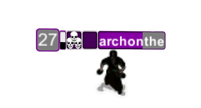
I think the best way to explain the new nameplate is left to right. Please ignore the fact that the Death Dealer’s nameplate is “Rogue Colored”.
Starting with the “Player Level” Frame:
- The Player Level Frame hasn’t changed much. It’s now a square, to save some space, and fills from bottom to top while leveling, instead of in a radial. Also, the amount of progress you have towards your next level will always be shown (instead of only while training). I believe there’s now enough class colors throughout the nameplate to remove a little here.
- Attack/Training Meter is the skinny bar to the right of the Player Level Frame. This meter serves 3 functions:
- While in the barracks. Each full bar represents 10% of a level. This gives a magnified version of your leveling rate: Fill it 10 times, gain a level.
- While out of the barracks, this bar shows your attack cooldown. This should make it easier to see when and how often you’re firing, which can be difficult when sharing a tower. This also removes the need for the “disabled icon” over your level, as the bar also shows the cooldown.
- The color of the meter corresponds to the gem you’re using.
- The Specialization Icon is next. I’m still working towards finding an easy-to-read icon for each spec. One advantage of having a specified space for the spec icon is that it can be used as a UI element (akin to the Potion Master, Gunner, and Death Dealer). I want to add more of this type of functionality to specs – such as a visible timer for the ninja’s teleport (which may or may not help, given the stream delay).
- The Gear/Perk Icon is after that. I haven’t decided what to call the new system. However, your selection will make a significant difference to your character, and I like having the option to utilize that UI in a similar fashion as the Spec Icons.
- The Power Bar is the last item on the basic namePlate. The text is a little smaller, and some names will get cut off earlier. This was the only real sacrifice I had to make, and it seemed worth the extra space it freed up. I am going back and forth of the font size, so input there would be appreciated: Would you be willing to lose 1-2 characters in exchange for the same font size you had before this update?
- The “bonus XP text” which used to appear to the side of the nameplate, now replaces your player name for 8 seconds (which is subject to severe tweaking). This was another idea for saving UI space. I will likely do the same for the AFK text (alternating back and forth between the player name and “AFK”).
- The Bonus Slot is an extra frame that appears to the right of the power bar, when needed. It is currently only used to hold the “coin” on Double Trouble (for the Wisdom Altar), and for the timer for Dune Gauntlet’s Challenge Altar. However, I like having the option to utilize this UI element into other maps.
Facebook Comments